Tuesday 23 November 2010

Even More Progress!

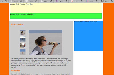
Worked with my friend from Whiplash Design again, and managed to get my gallery to a decent size and get it in my main content div. Really excited now, the site is starting to take place:
I need to go back to my original wireframe and work a bit more on the design now! I especially want to design a very cool logo that epitomises me and all my travels (this is the life and times of me after all!). This photoshop tutorial might inspire me - I will give it a go tomorrow!

Sunday 21 November 2010

Menu Navigation Ideas

Chatting with my friend on skype and they showed me these cool menu bars from CSS Play (becoming a favourite site I think! Check it out - what do you think of something like this with some of my travel photos behind it?? http://www.cssplay.co.uk/menus/artists_dd.html


And here is a really simple menu scheme that just uses CSS and could look nice with colours integrated to the site: http://www.cssplay.co.uk/menus/pro_drop11.html

Saturday 20 November 2010

Logo Design Idea

I am thinking of having a stamp style logo for the talesfromloz site (another play on words - wish you were here?). Here is a great photoshop tutorial for creating that border effect for a photo.

Back to the image gallery

I have an image gallery! I looked through quite a few and then eventually a call to my friend, owner of whiplashdesign.co.uk directed me to another gallery from cssplay.co.uk which is again just using html and css but is plain and has the functionality and positioning I am after. The original gallery is here and you can see the screen shots below of how I have begun to alter it:


Brilliant hey??? Each of the images changes as you click on the thumbnail to the left, and working in both safari and firefox. 

I am still confused about some of the CSS but pleased its working after a bit of experimentation. Tomorrow I need to work out how to get the gallery into my main content div from earlier!

More Div Tag Awesomeness

I have now gone through and added margins and floats to the div tags, so that everything is nicely laid out.... I have only tested this in safari, but I have to tell you it is a relief to actually get to this point.

Back to Divs

OK, had a bit of a play with image galleries now need to revisit div tags because I have real issues with laying stuff out on the page. The tutorial that has just explained this for me in plain English is the Lynda.com Dreamweaver CS5 Essential Training, Chapter 10 video 7 - creating structure with div tags. It explains really well how to stack div tags so that they display in order in a browser even if the browser cannot use the CSS. I now have all the div tags I need - including a wrapper! - to get started laying out content - here you can see the separate tags.

Bonus. Thanks Lynda.

Mucking around with image galleries

From my perspective (that is, the perspective of someone who is not a designer!), one of the hardest parts is trying to translate what I want my site to look like from my head onto a page. In the case of the image galleries, I am really hoping to magically come across a gallery that looks pretty close to how I want it on my page and borrow it making just a few alterations. 

You wouldn't think it would be that hard! There are dozens out there. One of my objectives is that I would like to keep the coding quite simple so that I can easily understand it and explain it to someone should the need arise.

So simple in terms of my abilities at the stage probably means just a html & CSS gallery so I start by looking for those - the lecturer gave a link to a post from smashing magazine 30 scripts for image galleries. Under CSS based image galleries I came across this really cool, really simple script from cssplay.co.uk that uses unordered lists (simple!) to layer and hide images and then appear as you mouse over. 

Well I managed to get the script to work! Here is evidence I managed to quite easily copy the html and css code and get both the horizontal and vertical versions to work (apologies for not being sophisticated enough to actually put the moving example in! You can go to the script page above to see how it works!):


Visual Design and Images for the Web

Have just spent about 3-4 hours reviewing the material from yesterdays lecture based around Visual Design and Images for the Web. This was a good lecture to finally get as the idea for my site is based around showing off some of the photos from all of my trips.

We covered off gif vs jpg vs png etc and there really is a lot of material about this on the web. The general convention is that JPEG is the best file format used for photographs (explained here) and this is also supported by advise from webstyleguide.com. So I will need to ensure all my photographs are saved as appropriate sized jpg files. 

Webstyleguide.com also offers: 
When you are creating graphics for web pages you should always use the 1:1 display ratio (one pixel in the image equals one pixel on the screen), because this is how big the image will display on the web page   Images that are too large should be reduced in size with an image editor such as Adobe Photoshop to display at proper size at a resolution of 72 ppi
 
I will follow this advice when preparing the content for my website.

One thing I have to consider is the height and width of my photos. I really have to experiment with the layout to get that right. The lecture notes spoke about The Golden Ratio in Web Design and The Grid System - grids as an aid to practical application of the golden ratio. So I have downloaded a template from 960gs to play around with the layout in photoshop.

The lesson also went over editing images in dreamweaver and change image on rollover etc.

It broadly discussed galleries, but this is something (as you will get from last weeks blog posts!) that I really want to have included as a key feature of my site, so I am now going to go a spend some time looking at galleries and look for ideas (and maybe even a design!) that I can use at talesfromloz.com

Wednesday 17 November 2010

A Gallery Idea

I just wanted to flag this while I saw it - this site http://www.thebathhousevenue.com/Gallery.aspx uses a really cool flash application to bring up photo galleries via twitter - shame I probably won't get a chance to learn much flash. Need to focus on KISS

Saturday 13 November 2010

Container Div

Ok so I think you can add a container div - I did it in design view and just shifted all the content in. Its still a mess though, but at least the menu is in a better position!

Spry Menus and Navigation

Yesterday the lesson was about menu navigation - we learned about lists and then jumped into adding a spry widget - which is a fairly intuitive Dreamweaver tool that lets you add your own menu bar using a wysiwyg feature.

You can see I am probably a bit ahead of myself as the alignment is all out.


I am hoping that what I need is actually a container div - missing from when I was setting up all the div tags earlier. Hopefully I am right and hopefully this is easy to add afterward, but knowing my luck probably not. Here goes...

DIV tags

So, going back a few steps I promised to cover what we learned last week - which was div tags and positioning.

The long and short of it is, a < div > tag will separate content and allow you to arrange things in a certain way. You can create an absolute div which will mean the content inside the tag will stay where you have positioned it no matter what (so if you change the size of the browser the content will not move with it).

I have decided for usability purposes, to NOT use absolute divs, however, thanks to Lynda, I work out that to first help me put stuff where I want, I can draw an AP div and then change the positioning after. Very useful. Here is a screen shot of what I have been experimenting with this morning:


I have 3 div tags identified - a header, an image, and the content. What I would ultimately like is for the image to be centred and rotating through a couple of my pictures from that place. Previous 2 blog posts ramble on about how I cant quite get that happening - for now, I cant even get the darn image to centre in the div!! As I said earlier - parking it for now and I need to think a little about what we learned yesterday - navigation.

Lynda will save me...

When I bought my copy of CS5 Design Premium, Adobe gave me a choice of free gifts - I have chosen a free 30 days subscription to lynda.com and to my great relief their are excellent tutorials for all of the adobe products - I was up until 2am last night watching CSS tutorials and I already feel a bit better about approaching this site.

I had another go at rotating images this morning (sucker for pain - but I am still in bed!), found this article which shows how to do it in Dreamweaver. Its javascript again, and I am still having trouble making it do what I want it to - and where I want on the page. I think I will have to park it and put a static image for now, see how I go getting the basis of a template for the main content pages which will be each towns page. I am thinking maybe I will get Lynda to show me how to do a rotating image in flash - or at least next week I can consult the lecturers about how best to approach it.

Friday 12 November 2010

New Blog Title: World's Most Boring Blog

Ok I know I have skipped another blog post for last weeks lesson, but I had a good excuse – there was road trip to Amsterdam at stake! I did take notes though so I will cover that in a bit….

First I need to make an admission.

I have come to the realisation that in my career as a marketeer, I may have underestimated the technical skills and patience required by programmers - even to use programs like Dreamweaver. And, <big admission here>, the time it takes to code a site to a clients exact specifications.

Not just developers though – designers too! Although today’s Photoshop tutorial came a bit more naturally than the Dreamweaver course – I am definitely a pictures person, so to speak.

I know probably at some point it must just be natural for them, but in these early stages it matches the frustration of a small child trying to count and not knowing what the next number is – even though they have been told a thousand times.

Although when I reflect on this – that is not actually the way the course is taught (as in wrote learning numbers), which is somewhat frustrating. I very much want someone to help me put together a “kit-home” style website, so I can better see how the pieces interact.

The course very much explains a concept, discusses why it is or isn’t important, and encourages experimentation – which takes a lot more time than I have been devoting to the course so far.

I am a bit ahead of myself today, last week we covered positioning and <div> tags, this week navigation menus. Trying to match the functionality I imagined in my head (and from the design I discussed in the last posts) required engaging spry widgets which require a solid understanding (at least) of what has been covered on HTML and CSS in the last 6 weeks.

I need to take stock. I am taking it back to the beginning – and going to experiment a little bit with just putting HTML and copy on a page and see what happens.

<Dear Reader – here it gets very very boring and rambles through my code experimentation… best stop now>

Got the basics of headers and even a table.

I get to a certain point where I have text and an image – but I want to show more than one image and I don’t want it to take up too much space… I do a Google search and come up with this code – which I have altered to rotate 3 images of mine – from locations on the Internet…. It would be easy to just link them to Flickr… but Pat said today that unless there is a good reason for it, we should embed all the video and images on the site – the only good reason is that I don’t know how to do it. Here is the code I have now, below the </head tag> anyway:

<script type="text/javascript">
function checkImg(){
img = document.getElementById('myImage');
imgOrig = "http://farm1.static.flickr.com/132/332028269_5d285610de_o.jpg";
imgNew = "http://farm1.static.flickr.com/154/332028434_4a4c5cdd4f_o.jpg";
(img.src==imgOrig)?img.src=imgNew:img.src=imgOrig;
}
setInterval("checkImg()",10000);
</script>
</head>
<body>
<img id="myImage" src="images/riodejaneiro2.jpg" width="800" height="600" alt="corvoda" /><img src="images/riodejaneiro1.jpg" width="800" height="600" alt="rio" />
</body>
</html>

This next lot of code does not work, I think it has something to do with the <body> tag positioning:

<body>
<script type="text/javascript">
function checkImg(){
img = document.getElementById('myImage');
imgOrig = <img id="myImage" src="images/riodejaneiro1.jpg" width="800" height="600" alt="corvoda" /><img ;
imgNew = <img id="myImage" src="images/riodejaneiro3.jpg" width="800" height="600" alt="corvoda" /><img ;
(img.src==imgOrig)?img.src=imgNew:img.src=imgOrig;
}
setInterval("checkImg()",10000);
</script>
</head>
<img id="myImage" src="images/riodejaneiro2.jpg" width="800" height="600" alt="corvoda" /><img
</body>

For now I conclude that that is a test and that is enough for now. I am not going to get hung up on Javascript – yet!

What I think it does illustrate is that I am already bored without CSS and fancy stuff. No wonder we talk about  an “old school” style of 90’s webpages when we only had HTML and tables at our disposal – if only I had of started learning this stuff back then.