
Thursday 30 December 2010
Bored of Photoshop? A cool website
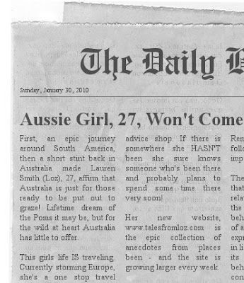
Whilst I was looking for inspiration for the front page "newspaper" article I came across this really cool website that I wanted to share: http://www.fodey.com/generators/newspaper/snippet.asp you can create a very realistic looking folded newspaper like the one I did below:
Front Page Images
I have never had so much appreciation for the work designers do as after doing this course. All types of designers, graphic designers and web designers in particular - creativity takes time and skill! I have just spent days thinking about what the best home page images for my site will be - and coming up with the idea is one thing - designing it is the next! Let me reiterate - I am not a designer!!
But, with my limited photoshop skills, I am very pleased that I have just completed the first image for my homepage - the idea is a newspaper style image that 'explains' the site - I am not going home and will continue to travel. Here is a screen shot:

Saturday 25 December 2010
A Christmas Miracle
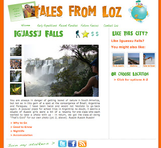
I have written and organised the content for 6 content pages on the site - phew! I just need to fix the main navigation and do and the social media footer and I will have something up for testing. Here is one of the pages.

Home page gallery sorted
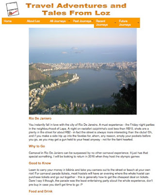
So after the struggles of the other evening, I realised of course I was linking the wrong stylesheet to the new homepage gallery!! I now pretty much have the framework for the homepage. My aim this morning is to finalise the shape / template for the main content pages and then by the end of today get 9 content pages finished - 3 for the past, 3 for the present and 3 for the future!!! Here is the home page and here is wishing me luck on this Christmas quest today!

Tuesday 21 December 2010
Tools for troubleshooting!
Never underestimate the benefit of getting another designer to run their eye over your code. Currently using skype to video chat while we look at the same code on a video conference!
Home Page
I am excited by the progress that has been made on the site, yet daunted by the looming deadline. I have moved on to the design of the home page. For ease of navigation through the site, the landing page should be a clear map to how to use the rest of the site. The vision is to remove the side bar and then create an enlarged gallery that echos the gallery on the main info page.
The bottom drop down feature should be replaced with 3 main images. One of these should lead to a dedicated video page - and lead to a selection of the best edited videos of my trips.
Well... we shall see.
The bottom drop down feature should be replaced with 3 main images. One of these should lead to a dedicated video page - and lead to a selection of the best edited videos of my trips.
Well... we shall see.
Tuesday 7 December 2010
Same Menu!
The menu is definitely getting there - I have altered it to display an alternative image on hover - which was not a feature of the CSS Play version (they used CSS styling to colour it) - now I just need to work on the positioning... and probably size of the text on the buttons - although the menu bar is really a function of the assignment brief (past present future) - the real key to the functionality of the site is the RHS menu bar - where you can choose from an alphabetised list of countries, so maybe its ok if the top menu bar recedes a little. I will consult some navigation advice.

Menu Ahoy! Well Almost!
Last night I was up late trying to crack this navigation bar without using spry - I am dissatisfied that Adobe and even Lynda have provided these tools without sufficient information on how to customise them - even I can master colours and borders - not enough!
Nevermind, after having a play with some simple image-rollover menus and then an advanced CSS image menu from Web Designer Wall. Stu Nicholls of CSS Play has come to my rescue with exactly what I need. I have just begun customising his image dropdown menu. Have to work now but cant wait to tackle the rest of it!

Saturday 4 December 2010
The design is starting to form
Spry menus and ajax to talk about from the lessons, but for now here is how the design is shaping up.

Tuesday 23 November 2010
Even More Progress!
Worked with my friend from Whiplash Design again, and managed to get my gallery to a decent size and get it in my main content div. Really excited now, the site is starting to take place:

I need to go back to my original wireframe and work a bit more on the design now! I especially want to design a very cool logo that epitomises me and all my travels (this is the life and times of me after all!). This photoshop tutorial might inspire me - I will give it a go tomorrow!
Sunday 21 November 2010
Menu Navigation Ideas
Chatting with my friend on skype and they showed me these cool menu bars from CSS Play (becoming a favourite site I think! Check it out - what do you think of something like this with some of my travel photos behind it?? http://www.cssplay.co.uk/menus/artists_dd.html
And here is a really simple menu scheme that just uses CSS and could look nice with colours integrated to the site: http://www.cssplay.co.uk/menus/pro_drop11.html
Saturday 20 November 2010
Logo Design Idea
I am thinking of having a stamp style logo for the talesfromloz site (another play on words - wish you were here?). Here is a great photoshop tutorial for creating that border effect for a photo.
Back to the image gallery
I have an image gallery! I looked through quite a few and then eventually a call to my friend, owner of whiplashdesign.co.uk directed me to another gallery from cssplay.co.uk which is again just using html and css but is plain and has the functionality and positioning I am after. The original gallery is here and you can see the screen shots below of how I have begun to alter it:


Brilliant hey??? Each of the images changes as you click on the thumbnail to the left, and working in both safari and firefox.
I am still confused about some of the CSS but pleased its working after a bit of experimentation. Tomorrow I need to work out how to get the gallery into my main content div from earlier!
More Div Tag Awesomeness

I have now gone through and added margins and floats to the div tags, so that everything is nicely laid out.... I have only tested this in safari, but I have to tell you it is a relief to actually get to this point.
Back to Divs
OK, had a bit of a play with image galleries now need to revisit div tags because I have real issues with laying stuff out on the page. The tutorial that has just explained this for me in plain English is the Lynda.com Dreamweaver CS5 Essential Training, Chapter 10 video 7 - creating structure with div tags. It explains really well how to stack div tags so that they display in order in a browser even if the browser cannot use the CSS. I now have all the div tags I need - including a wrapper! - to get started laying out content - here you can see the separate tags.
 Bonus. Thanks Lynda.

Mucking around with image galleries
From my perspective (that is, the perspective of someone who is not a designer!), one of the hardest parts is trying to translate what I want my site to look like from my head onto a page. In the case of the image galleries, I am really hoping to magically come across a gallery that looks pretty close to how I want it on my page and borrow it making just a few alterations.
You wouldn't think it would be that hard! There are dozens out there. One of my objectives is that I would like to keep the coding quite simple so that I can easily understand it and explain it to someone should the need arise.
So simple in terms of my abilities at the stage probably means just a html & CSS gallery so I start by looking for those - the lecturer gave a link to a post from smashing magazine 30 scripts for image galleries. Under CSS based image galleries I came across this really cool, really simple script from cssplay.co.uk that uses unordered lists (simple!) to layer and hide images and then appear as you mouse over.
Well I managed to get the script to work! Here is evidence I managed to quite easily copy the html and css code and get both the horizontal and vertical versions to work (apologies for not being sophisticated enough to actually put the moving example in! You can go to the script page above to see how it works!):


Visual Design and Images for the Web
Have just spent about 3-4 hours reviewing the material from yesterdays lecture based around Visual Design and Images for the Web. This was a good lecture to finally get as the idea for my site is based around showing off some of the photos from all of my trips.
We covered off gif vs jpg vs png etc and there really is a lot of material about this on the web. The general convention is that JPEG is the best file format used for photographs (explained here) and this is also supported by advise from webstyleguide.com. So I will need to ensure all my photographs are saved as appropriate sized jpg files.
Webstyleguide.com also offers:
When you are creating graphics for web pages you should always use the 1:1 display ratio (one pixel in the image equals one pixel on the screen), because this is how big the image will display on the web page Images that are too large should be reduced in size with an image editor such as Adobe Photoshop to display at proper size at a resolution of 72 ppi
I will follow this advice when preparing the content for my website.
One thing I have to consider is the height and width of my photos. I really have to experiment with the layout to get that right. The lecture notes spoke about The Golden Ratio in Web Design and The Grid System - grids as an aid to practical application of the golden ratio. So I have downloaded a template from 960gs to play around with the layout in photoshop.
The lesson also went over editing images in dreamweaver and change image on rollover etc.
It broadly discussed galleries, but this is something (as you will get from last weeks blog posts!) that I really want to have included as a key feature of my site, so I am now going to go a spend some time looking at galleries and look for ideas (and maybe even a design!) that I can use at talesfromloz.com
Wednesday 17 November 2010
A Gallery Idea
I just wanted to flag this while I saw it - this site http://www.thebathhousevenue.com/Gallery.aspx uses a really cool flash application to bring up photo galleries via twitter - shame I probably won't get a chance to learn much flash. Need to focus on KISS
Saturday 13 November 2010
Container Div
Ok so I think you can add a container div - I did it in design view and just shifted all the content in. Its still a mess though, but at least the menu is in a better position!

Spry Menus and Navigation
Yesterday the lesson was about menu navigation - we learned about lists and then jumped into adding a spry widget - which is a fairly intuitive Dreamweaver tool that lets you add your own menu bar using a wysiwyg feature.
You can see I am probably a bit ahead of myself as the alignment is all out.

I am hoping that what I need is actually a container div - missing from when I was setting up all the div tags earlier. Hopefully I am right and hopefully this is easy to add afterward, but knowing my luck probably not. Here goes...
DIV tags
So, going back a few steps I promised to cover what we learned last week - which was div tags and positioning.
The long and short of it is, a < div > tag will separate content and allow you to arrange things in a certain way. You can create an absolute div which will mean the content inside the tag will stay where you have positioned it no matter what (so if you change the size of the browser the content will not move with it).
I have decided for usability purposes, to NOT use absolute divs, however, thanks to Lynda, I work out that to first help me put stuff where I want, I can draw an AP div and then change the positioning after. Very useful. Here is a screen shot of what I have been experimenting with this morning:

I have 3 div tags identified - a header, an image, and the content. What I would ultimately like is for the image to be centred and rotating through a couple of my pictures from that place. Previous 2 blog posts ramble on about how I cant quite get that happening - for now, I cant even get the darn image to centre in the div!! As I said earlier - parking it for now and I need to think a little about what we learned yesterday - navigation.
Lynda will save me...
When I bought my copy of CS5 Design Premium, Adobe gave me a choice of free gifts - I have chosen a free 30 days subscription to lynda.com and to my great relief their are excellent tutorials for all of the adobe products - I was up until 2am last night watching CSS tutorials and I already feel a bit better about approaching this site.
I had another go at rotating images this morning (sucker for pain - but I am still in bed!), found this article which shows how to do it in Dreamweaver. Its javascript again, and I am still having trouble making it do what I want it to - and where I want on the page. I think I will have to park it and put a static image for now, see how I go getting the basis of a template for the main content pages which will be each towns page. I am thinking maybe I will get Lynda to show me how to do a rotating image in flash - or at least next week I can consult the lecturers about how best to approach it.
Friday 12 November 2010
New Blog Title: World's Most Boring Blog
Ok I know I have skipped another blog post for last weeks lesson, but I had a good excuse – there was road trip to Amsterdam at stake! I did take notes though so I will cover that in a bit….
First I need to make an admission.
I have come to the realisation that in my career as a marketeer, I may have underestimated the technical skills and patience required by programmers - even to use programs like Dreamweaver. And, <big admission here>, the time it takes to code a site to a clients exact specifications.
Not just developers though – designers too! Although today’s Photoshop tutorial came a bit more naturally than the Dreamweaver course – I am definitely a pictures person, so to speak.
I know probably at some point it must just be natural for them, but in these early stages it matches the frustration of a small child trying to count and not knowing what the next number is – even though they have been told a thousand times.
Although when I reflect on this – that is not actually the way the course is taught (as in wrote learning numbers), which is somewhat frustrating. I very much want someone to help me put together a “kit-home” style website, so I can better see how the pieces interact.
The course very much explains a concept, discusses why it is or isn’t important, and encourages experimentation – which takes a lot more time than I have been devoting to the course so far.
I am a bit ahead of myself today, last week we covered positioning and <div> tags, this week navigation menus. Trying to match the functionality I imagined in my head (and from the design I discussed in the last posts) required engaging spry widgets which require a solid understanding (at least) of what has been covered on HTML and CSS in the last 6 weeks.
I need to take stock. I am taking it back to the beginning – and going to experiment a little bit with just putting HTML and copy on a page and see what happens.
<Dear Reader – here it gets very very boring and rambles through my code experimentation… best stop now>
Got the basics of headers and even a table.
I get to a certain point where I have text and an image – but I want to show more than one image and I don’t want it to take up too much space… I do a Google search and come up with this code – which I have altered to rotate 3 images of mine – from locations on the Internet…. It would be easy to just link them to Flickr… but Pat said today that unless there is a good reason for it, we should embed all the video and images on the site – the only good reason is that I don’t know how to do it. Here is the code I have now, below the </head tag> anyway:
<script type="text/javascript">
function checkImg(){
img = document.getElementById('myImage');
imgOrig = "http://farm1.static.flickr.com/132/332028269_5d285610de_o.jpg";
imgNew = "http://farm1.static.flickr.com/154/332028434_4a4c5cdd4f_o.jpg";
(img.src==imgOrig)?img.src=imgNew:img.src=imgOrig;
}
setInterval("checkImg()",10000);
</script>
</head>
<body>
<img id="myImage" src="images/riodejaneiro2.jpg" width="800" height="600" alt="corvoda" /><img src="images/riodejaneiro1.jpg" width="800" height="600" alt="rio" />
</body>
</html>
This next lot of code does not work, I think it has something to do with the <body> tag positioning:
<body>
<script type="text/javascript">
function checkImg(){
img = document.getElementById('myImage');
imgOrig = <img id="myImage" src="images/riodejaneiro1.jpg" width="800" height="600" alt="corvoda" /><img ;
imgNew = <img id="myImage" src="images/riodejaneiro3.jpg" width="800" height="600" alt="corvoda" /><img ;
(img.src==imgOrig)?img.src=imgNew:img.src=imgOrig;
}
setInterval("checkImg()",10000);
</script>
</head>
<img id="myImage" src="images/riodejaneiro2.jpg" width="800" height="600" alt="corvoda" /><img
</body>
For now I conclude that that is a test and that is enough for now. I am not going to get hung up on Javascript – yet!
What I think it does illustrate is that I am already bored without CSS and fancy stuff. No wonder we talk about an “old school” style of 90’s webpages when we only had HTML and tables at our disposal – if only I had of started learning this stuff back then.
Saturday 30 October 2010
Organising the Design
OK, so I have had a go at visually organising the top level information, or home page.

I like the idea of asking people to contribute to a carbon offset program to alleviate some of the environmental impact of my travel. When I thought of it I just had to sketch what the front page might look like.
Now I have used this process to decide how content will be organised, I need to get stuck into the copy!
The Results Are In.
29 people filled out my survey. Not a bad result for 499 Facebook friends and 100 followers on Twitter - almost a 5% response rate which is probably an excellent return on a small social media response campaign.
The results are not surprising, and has enabled me to understand how best to organise the content of what will be the most commonly occuring template in the site.
I have developed a sketch, or wireframe using PowerPoint. Well, old habits die hard. This gives me a framework for collating content.

This brings an interesting planning question to the web design process - what comes first the content or design?
One school of thought says Get the content written first. Be happy with the tone and language. (then) Decide on the style. Another argues that designing first is not user focused.
A view I agree with is that both need to be considered concurrently. Without good content, design is a vacuous bauble that catches your eye momentarily but quickly bores you. And without good design, content is that boring professor who knows more than you’ll ever need, but lectures away in monotone and rambles from topic to topic with no rhyme or reason.
An excellent article from techradar.com discusses how websites designed for the desktop allow more elements to be added to the page, it suggest that elements are added for the sake of using space - when actually, efficient design - such as that required for mobile ready sites (ie smaller screen size) are much better at providing the key information sought by the user up front and central.
Sunday 24 October 2010
Even a just little bit of research helps
My survey has been up for an hour and has 6 responses already, it may not seem like many but I am already getting ideas for ensuring content is relevant, and on how to better organise it.
Site Structure, Planning & Information Architecture
This week we discuss key usability considerations – site structure and information architecture. The importance of good web design has cemented the profession of Information Architect. The lecturer’s notes quote an Information Architect to be a person who creates the structure or map of information which allows others to find their personal paths to knowledge. Well, that’s one quote, but the suggestion that the concept is more “holistic” than data based, appeals most to me.
In the last post I discussed how a website development process should be treated like any new product development process. I am probably guilty of not paying enough attention to the planning process at one time or another, but aren’t all good brand and product marketers at times? There can be too much focus on just producing an end result, rather than the producing the best end result.
So for us brand marketers, if we review the product development process, we start off with the concept. I have made a decision about the broad concept of a website that, based on my own experience, provides travel information and recommendations. OK, sounds awful right, a Trip Advisor written from only one person’s perspective perhaps? Lets say the primary audience though is family and friends, you could maybe describe it as a personal blog that has had the information organized so that it means more to potential users.
The concept will need more detailed development before we move into feasibility. That means research with the target market. I have asked my contacts on Facebook and Twitter (mostly friends and family) to fill out a survey so I can better understand what might be the best type of content to include.
As the topic of this weeks lecture also suggests, I need to start giving thought to the site information architecture. I have travelled to over 30 country destinations world wide, when you then break that down to cities I am looking at big job ensuring interesting and engaging content.
Perspectives on Web Design
So I owe 2 posts for 2 classes! I am not waning in enthusiasm – just been busy.
Last weeks lecture was titled “perspectives on web design”. Pat talks about the different perspectives with which people will approach the web design project, and gives us some good sources of information.
The key advice that I am clinging onto from the notes is There's no point in having a nice design with easy navigation, if the content is unoriginal, uninteresting or just absent. You need to provide original and interesting content.
Another point also hit a chord – it was about asking for feedback. I think this is a key feature often missed, and something that wasn’t covered, was looking for feedback on the site – or content – before you go into site design.
My 7 years brand management experience tells me, a website development process should be treated like any new product development process. First you develop a concept, you might have a few ideas about what it will look like, but you need to talk to the people who you want to visit your site. We will discuss this a bit more in the next post.
Discussing design, we learn that, you can’t make assumptions about the people who visit your site, especially that they will be approaching from the same angle as you. Using a particular background because of personal taste is a no-no – use all the public research widely available on the web that talk about conventions in web design.
Accessibility for instance, is a key issue. From the W3C WAI, That means having a Web accessibility encompasses all disabilities that affect access to the Web, including visual, auditory, physical, speech, cognitive, and neurological disabilities. The site also discusses how important it is to put this into the planning of the site.
A site highly recommended in the class is the Web Style Guide – a free resource with boundless information – if you are planning on building a website make sure you review it, and I would start with the forward: this book has style…Web Style Guide delivers value and meaning to seemingly disparate audiences, from the student prodigy who would be webmaster to the grizzled veteran information architect who’s been there and organized that. True that.
From this class, I am already clear that simplicity is key, and that I will need to write myself a full web development brief, and am thinking about the rest of the planning recipe… oh, and I reckon to deliver interesting and entertaining content I can’t wait for week 6 to start the process! Gulp!
Sunday 10 October 2010
Some good advice...
This weekend life put me back in contact with a very old friend (bless Facebook) - its been 10 years since we saw each other, or round abouts, we were best mates in high school in class 7R or something like that. Turns out Xtina is a content producer for the website of a major radio network in Australia (my old home).
Over dim sum, Xtina gives me some good advice as I explain my dilemma about deciding how to approach the website project for this course.
Content is King she says and it clicks that obviously all those internet marketing websites that give the same advice, are not just talking about any content, about content for the sake of content - I need interesting content!
Its all about narcissism and voyeurism she says - people look at you so that you'll look at them. She speaks the truth.
Maybe she is right - even if I were to go the personal route, talking about my adventures - won't developing interesting content help me professionally as well?
Saturday 9 October 2010
First Class: An Introduction to Web Design
So day 1 of my classes in the London Metropolitan MA Digital Media. My first class is CMP002N Design for the Internet. Although at first I thought I wanted to stick mostly to the "consultancy" style courses (or "hands off" courses if you like.) I am doing this class for two reasons. 1 - because the course leader, Elena Moschini advised that even consultants, project managers and sales people should understand what is involved in designing websites for the internet so they can better select the people they work with, and understand when they are being ripped off (EXCELLENT ADVICE!), and 2 - because it fits with the class schedule so I can fit 2 classes on Fridays.
Pat Power is the lecturer and I instantly decided I liked him because he has an Irish accent and all Irish people I have met have been nice. It was only 5 minutes into the class however that I really felt like he was speaking another language!!
Now don't get me wrong, I think I have a fairly large digital footprint for a "classically" trained FMCG Brand Marketer (check out my Linked In profile), but really he was using acronyms I broadly only had to understand in the past. Try these. CERN, CSS, W3C, HTML (know that one!), SGML, Usenet, XML, oh and by the way, I have to not only understand these but apply them to build a website in DWCS4 by the end of the course. Yikes!
There are about a dozen people in this class who raised their hand when asked if they had ever done web design before. I dislike these people immensely and hope they choose to study another course by next week instead of bringing their fancy pants web design skills to induce further panic about what else I don't know!
50% of the mark will come from a critical report that is meant to be a reflective report about my experience building the site. So, this blog is going to be my attempt to track not just the progress of my project (which lets face it at Wk1 is already panic stations) but a record of the new things I learn to add to that project every week.
So the website project can't just be any website, the brief specifically states "Conceive, design and produce a website on the theme - 'The Life and Times of [your own name]'." My most and least favourite subject at the same time. I feel a lot of internal conflict building already.
I want this project to be for more than just marks, I want to be able to use it in the future. Will I make it a professional site dedicated to letting the world know about my new consultancy Digital Stuf Ltd - or will I reveal too much unprofessional-ness (oh God - see!!?) in the process?? Hmmm... maybe I could take the opportunity to scrapbook that 2 years worth of travel I have just done and finally do something with the 10kg box of paper, tickets memories etc under the bed..... but do I have the time for the daunting process of sorting and cataloging all that and be a consultant and do this Masters and have a life???
Well I don't need to decide now.... I do decide however that I will sketch out a few ideas in my notebook, which is a brilliant idea except for that I cant draw and I am looking back at my drawings from yesterday and all I think is WTF???? Now I know what THAT acronym means and I expect we will see it a few times during this course.
That's all for now, writing this has just got me in a tizzy. Its Saturday night and I think I need to do that "have a life part" at least while its still early in the course.
Subscribe to:
Posts (Atom)